As many of you know, I’ve created an accessible NCAA men’s basketball tournament bracket every year since 2006. This year I’ve been asked by multiple people to do the same for the 2010 FIFA World Cup. At first I embraced this idea! The World Cup is an awesome event, followed passionately if not religiously by fans on every continent. I like the idea of creating something that would bring sports fans with disabilities together from around the world, and of using the bracket as an opportunity to explore the relationship between internationalization and accessibility (e.g., providing content in different languages).
However, as I plunged into this project I came to realize that my little site could never capture the global excitement of the World Cup. Other sites provide constant news updates, scores, live games, and opportunities for fans to interact. Creating a separate comparatively quiet, bare bones site "for blind users only" simply wasn’t going to cut it. I do still plan to provide an accessible bracket once the tournament advances to the Knockout Stage, plus I have some other experiments in the works related to internationalization. None of that’s quite ready for prime time though, in any timezone.
So meanwhile, I thought I’d examine the accessibility of existing high-profile World Cup sites, which hopefully will be helpful information for folks who are looking for an accessible resource as the games approach. The sites I looked at are FIFA.com (the official World Cup site), World Cup 2010 on Yahoo! Sports, and World Cup 2010 on ESPN Soccernet.
Overall Structure
Each of these sites suffers from feature creep. There is so much content on the home pages, it’s overwhelming to know where to start. Fortunately, Yahoo! has ARIA landmark roles identifying the banner, search, navigation, main, and contentinfo (i.e., footer) sections of the page. This allows screen reader users to jump quickly to these sections. Neither the ESPN nor FIFA sites uses ARIA landmark roles.
Yahoo! also makes better use overall of HTML headings. They have 19 headings on their home page, which may seem like a lot until you consider that ESPN has 44 and FIFA has 47. I say this often when working with developers on web accessibility: It’s very important to include HTML headings on web pages to facilitate navigation for screen reader users (among other benefits), but more is not necessarily better. There’s a point at which having too many headings negates the benefits and is the same as having none.
Beyond the home page, the secondary pages on each of the three sites are comparatively clutter-free and easier to navigate, with the exception of ESPN. Their secondary pages aren’t excessively cluttered, but they’re not really secondary pages in a traditional sense (more on that in a moment).
On both Yahoo! and FIFA, one can navigate fairly easily just using the Level 2 headings. On Yahoo!, the Level 2 headings include items like "Groups", "Matches", and "News Headlines", all content that I’m most likely to be interested in. Similarly, the FIFA News page has only four Level 2 headings, and they all make sense: "Latest News", "Interviews", "Media Releases", and "Most Commented Most Viewed Latest" (hmmm… well, three out of four make sense).
In contrast, ESPN’s heading structure seems to be upside down. For example, the only Level 2 heading on the home page is "USA stars fit for opener"; and there are several similar Level 3 headings (e.g., "Altidore and Onyewu ready for England"). The real substantive headings are at Level 4: "Scores & Schedules","My Headlines", "Must Read", etc. I would expect this entire structure to be flipped.
Speaking of ESPN, all of its content is accessed via an AJAX-driven navigation menu that displays key content (e.g., Scores & Schedules, Teams & Groups) with a single click. However, this menu occurs – seemingly randomly – in the middle of the document source code, not at all where I would expect to find it based on its visual position near the top of the page. Consequently screen reader users and sighted keyboard users will have a very difficult time finding it, and once they do, the dynamic menu interface really requires ARIA for accessibility, but has none.
Group Stage
For those not familiar with the intricacies of the World Cup, the tournament is divided into two stages: The Group Stage and Stage 2 (aka the Knockout Stage). The Group Stage is a round-robin tournament in which groups of four teams play every other team within their groups. At the end of the Group Stage the teams that placed first and second in their group advance to the Knockout Stage, which is the point at which my Accessible FIFA World Cup Bracket might come in handy.
In the weeks leading up to the tournament, fans are eagerly studying the groups and making predictions about which group is the so-called "Group of Death". Groups are often presented as they are in the following snapshot from the Yahoo! site:
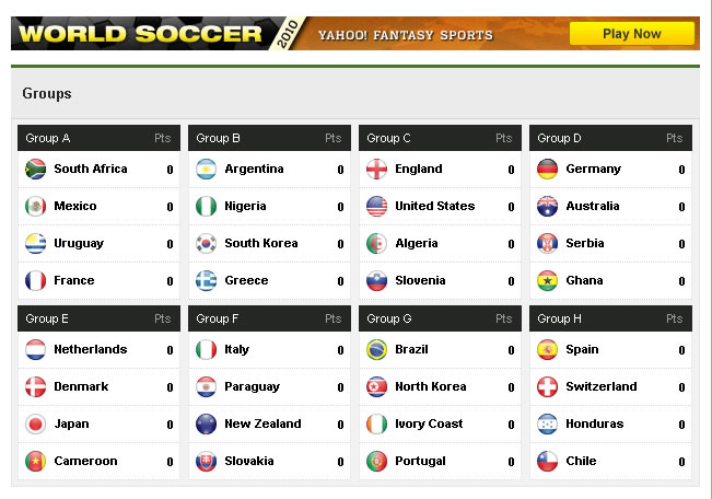
Visibly, the structure appears to me to be eight data tables, one for each group. The top row of each table has column headings with group name (e.g., "Group A", "Group B") and "Pts". Each subsequent table row includes the name of a team/country within that group (plus a circular interpretation of the country’s flag), and the total number of points for that country/team.
However, the actual coded structure is nothing like this. Each group is coded as a definition list of one item, where the definition term (<dt>) is the name of the group, and each of the four teams/countries (including its flag, name, and points) is a definition description (<dd>). This makes some sense semantically, since groups are defined by their members. However, I think the structure is probably confusing to screen reader users, especially those who are sensitive to grammatical oddities like "Definition list of one items".
Data Tables
The World Cup group standings, as is typical in sports, are presented in data tables, with cryptic single-letter column headings such as "P","W","D","L","GF","GA","GD", and "Pts", all of which might play a role in determining who the first and second placed teams are. Avid football/soccer fans probably all know what these abbreviations mean, but the rest of us could benefit from some help with that. This is a perfect opportunity to apply the <abbr> element, like this:
The FIFA site does this well. Browsers display the title when users hover over an abbreviation (see image below), and supporting screen readers announce the title if users have configured them to do so. Since in this case the abbreviations are table headers, screen readers announce the full title (rather than the cryptic abbreviation) as users navigate through the table, which makes the table much easier to understand.

Yahoo! approaches the problem differently: Rather than add an <abbr> element, they’ve adding a title attribute directly to the <th> element, like this:
There are at least three problems with the Yahoo! approach:
- At least a couple of browsers (Firefox and Opera) provide a visual cue for <abbr> elements (a dotted underscore) so sighted users know there’s an expanded abbreviation available as a tooltip. Adding a title attribute to other elements doesn’t have this same native effect in any browser.
- Screen readers don’t automatically read title attributes, and may only read them at all on certain elements such as images; not on <th> elements. In this case JAWS does not read the title attributes in the Yahoo! standings tables.
- If it’s an acronym, it should be identified as an acronym. Semantic markup is good.
Multilingual/Cultural/Timezone Support
Since the World Cup is a global event, multilingual users might be interested in exploring sites in languages other than their own so they can follow the coverage from multiple cultural perspectives. Screen readers that support multiple languages typically have the ability to switch between those languages on the fly, triggered by the HTML lang attribute. For example, if content is in English, it should be marked up with lang="en" and if content is in Español, it should be marked up with lang="es".
The FIFA and Yahoo! sites both do this. FIFA is available in English, French, Spanish, German, Portuguese, and Arabic, and each of these versions correctly uses the lang attribute to identify the language of the site. Yahoo! claims to have "global coverage" and lives up to that claim with 22 distinct World Cup sites, each with its own country focus and language, and each site uses the lang attribute correctly. In contrast, ESPN seems to be available only in English (U.S.), English (Global), and Spanish (if there are others out there I had no luck finding them), and none of these sites used lang attributes.
Also, on the ESPN site, the tournament schedule is displayed with games in Eastern Time, and there’s no obvious way to change that to my local timezone. The Yahoo! United States site exhibits this same Eastern timezone bias, but the other of its 22 sites report game times in a timezone that makes sense for that country.
FIFA goes a bit further. They present all games in South Africa time, but provide a link immediately above the schedule that allows users to change the times to their local time (as determined programatically by JavaScript).
Accessibility of Images
Both Yahoo! and ESPN are batting about .500 on alt attributes (in baseball that’s good; in web accessibility it’s not). The FIFA site is much better: Only three images on the home page are missing alt attributes. In fact, most of the images on the FIFA site not only have alt attributes, but also longdesc attributes. The purpose of longdesc is described on a couple of my previous blog posts, one titled Long Description of Images and the other Contemplating Risk.
I hate to criticize the FIFA developers at all since they used longdesc, which very few web developers do. However, they didn’t use it correctly. They entered long descriptive text directly into the value of their longdesc attributes, whereas the value of longdesc is supposed to be a URL pointing to a separate web page that contains the long description. Nevertheless, in this case it works because each image is also a link, and when JAWS (and presumably other screen readers too) announces "Press Enter to access a long description", pressing Enter actually does take users to a relevant page where additional detail is easily available.
Video
All of the sites have video, and at a glance, none of the video players seem to be accessible to anyone except mouse users with eyesight. The most accessible way to watch the World Cup games is likely to be the various television stations that comprise the ESPN network (ESPN, ESPN2, and ABC), or Univision.
ESPN also has Mobile TV, an iPhone App, and an ESPN radio iPhone app (all of which are described on ESPN’s coverage page. I haven’t tried any of these options yet, but I’ll be eager to see whether they can be operated with VoiceOver.
Yahoo! Sucks
Before I found the Yahoo! World Cup page, I spent some time on the Yahoo! Sports home page, and I have to share what an incredibly annoying experience that was. The page does a complete refresh every 180 seconds, which is utterly disruptive for screen reader users, sending them back to the top of the page, and annoying for everyone else. In this the Era of AJAX, I’m surprised at this, especially from Yahoo!.
Yahoo! is Cool
Only Yahoo! knows that rectangular flags are well, square. Round flags are hot.

Another Contender: Wikipedia
Another great resource for World Cup coverage is Wikipedia. The folks who maintain the World Cup pages seem to be truly committed to doing that, and I suspect it may provide timely updates to scores and standings. As is typical with Wikipedia pages, it has good heading structure and is easy to navigate. It’s also available in countless dozens of languages (all of which use the lang attribute!), it presents Group membership using a data table rather than a definition list, and it includes <abbr> elements in the standings tables.
The best place to start is the Wikipedia 2010 FIFA World Cup page.
Names of teams/countries, names of players, and names of groups are all links to pages that provide amazing additional detail. The Group pages in particular are setup to include standings within the group, game times, and probably scores (for example, see 2010 Group C).
¡Viva el fútbol!
One reply on “2010 FIFA World Cup: An Accessibility Review of Leading WebSites”
Just confirmed that the ESPN 2010 FIFA World Cup iPhone app is not accessible with VoiceOver. You can navigate the menus, but most of the content is just announced as "Button", including the matchups and scores.